For weeks, new favURL users landed on a finished page and a dashboard full of buttons, and most of them just looked at it. The page was already good, generated from their Google reviews in 20 seconds, so there was nothing forcing them to explore. They never found half of what the product could do.
So I built onboarding. Not a tour, not a popup carousel. Six small tasks that each teach one part of the platform while making the page measurably better.
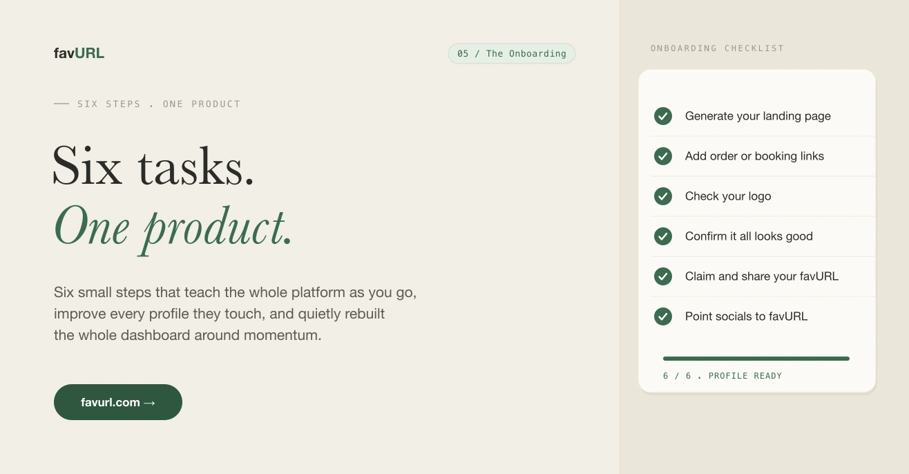
Here are the six:
- Generate your landing page
- Add your direct order or booking links
- Check your logo
- Confirm that everything is looking good
- Claim and share your favURL
- Update your social media links to favurl.com/YOU
Each one is a real improvement to the profile, not busywork. By the time someone finishes, they have used the core of the product and their page is genuinely complete. Here is what building it taught me.
Four things it taught me
The task has to improve the thing, not explain it. Every step had to leave the user’s page better than before. A tooltip that says “you can add hours here” does nothing. A task that says “add your order links” and shows the page update in real time does both jobs at once. People learn the feature because they just used it for real.
Order is a feature. I sequenced the six tasks from highest payoff to lowest friction, not in the order they live in the menu. Generating the page comes first because it is the moment the product proves itself. Pointing your social links to favURL comes last because it only matters once the page is worth sending people to. Reordering the same six tasks changed completion more than any copy edit I made.
Completion needs to be visible and finite. Six is a number people will finish. A progress bar that fills, a count that ends at six, a clear “you are done” state. Open-ended checklists feel like chores. A bounded one feels like a small win you can actually collect.
Skipping is fine, stalling is not. Letting people skip a task kept them moving. The dangerous state was never the skip, it was the user sitting on one step with no idea what it would cost them. Showing what each task adds to the page removed the hesitation.
What I added
To make all of that work I added a few things under the hood:
- A real onboarding state per account, so progress survives reloads and follows the user across devices.
- Live page preview tied to each task, so every action shows its effect immediately instead of after a save.
- AI powered draft copy and bio baked into the generate step, so the page arrives mostly written instead of blank.
- Gentle nudges for the one or two tasks left undone, instead of a wall of unread notifications.
None of it is flashy. All of it removes a reason to stop.
What it did to the dashboard
The surprise was the dashboard. Once the six tasks existed, the old dashboard made no sense. It was a flat grid of features with no sense of what to do next.
So I rebuilt it around the onboarding. The checklist now sits at the top for new accounts and quietly collapses into a small “profile health” indicator once you finish. The dashboard went from a menu you scan to a path you walk, and then to a clean workspace once there is nothing left to set up.
That is the part I did not plan. Building good onboarding forced the rest of the product to get clearer. Six small tasks ended up redesigning the whole first run, and the dashboard is better for everyone, not just new users.
More soon.