Not every part of a content site grows at the same speed.
On Qysh Me, one section pulled ahead of everything else so clearly that it started to feel like a separate publication living inside ours. The recipes.
So we gave it its own name, its own front door and eventually its own way of making money. We called it Qysh Me Gatu.
A section that outgrew its category
Cooking was never supposed to be the main event. It was one category among many, next to technology, family and cars.
But recipes have a property most how-to content does not. People come back to them on a schedule. Every day, right before dinner.
That traffic was loyal in a way a one-time answer like “how to open a Gmail account” never could be.
So we leaned in. We built the cooking section out under qysh.me/gatu, organized into its own taxonomy: Tradicionale, Gjella, Brumëra, Sallata, Supa, Turshi, Ushqim i Shpejtë, Skarë, Ëmbëlsira, Pije. We kept filling it until it held more than 250 recipes.
It had its own “receta e ditës.” Its own most-recent list. Its own audience that mostly did not care about the rest of the site.
The sofrabez
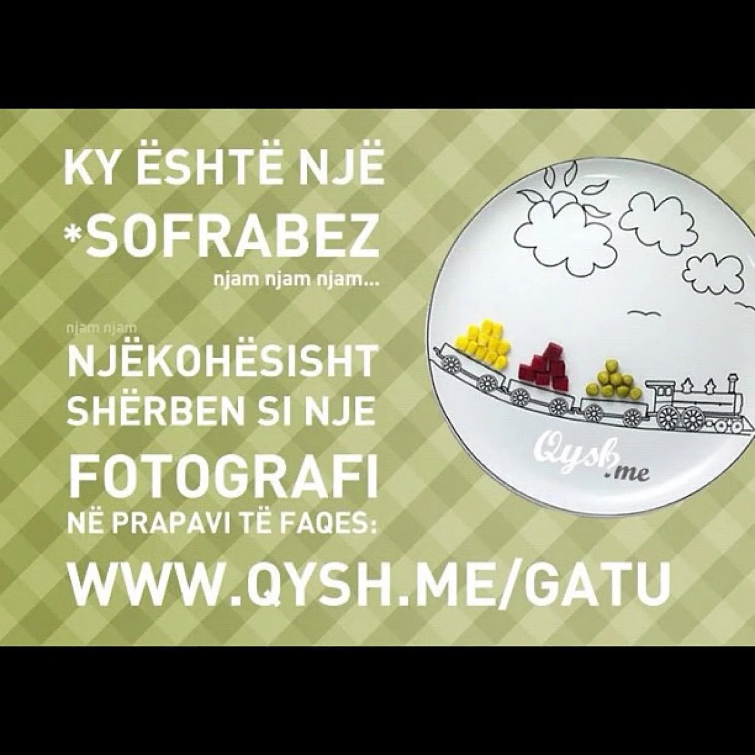
The piece of it I loved most was not a feature. It was a photograph.
We designed the section header as a sofrabez. The round tablecloth families spread on the floor to eat around. With a little illustrated train carrying food across a plate.
It was warm. It was unmistakably ours. And it did the job a logo is supposed to do. In one glance you knew whose kitchen you were in.
Good branding for a cooking site is not a wordmark. It is a table you want to sit at.
The first ads we ever sold
Gatu is where Qysh Me first became a business, not just a project.
Its audience was specific enough to describe to an advertiser in one sentence. Largely women between 18 and 45, cooking at home. And a specific audience is a sellable one.
So we put together a simple rate card:
- A main banner (800x100) across the top of the section
- A side banner (300x300) in the sidebar
- A line of sponsored text at the end of a recipe for 50 euro
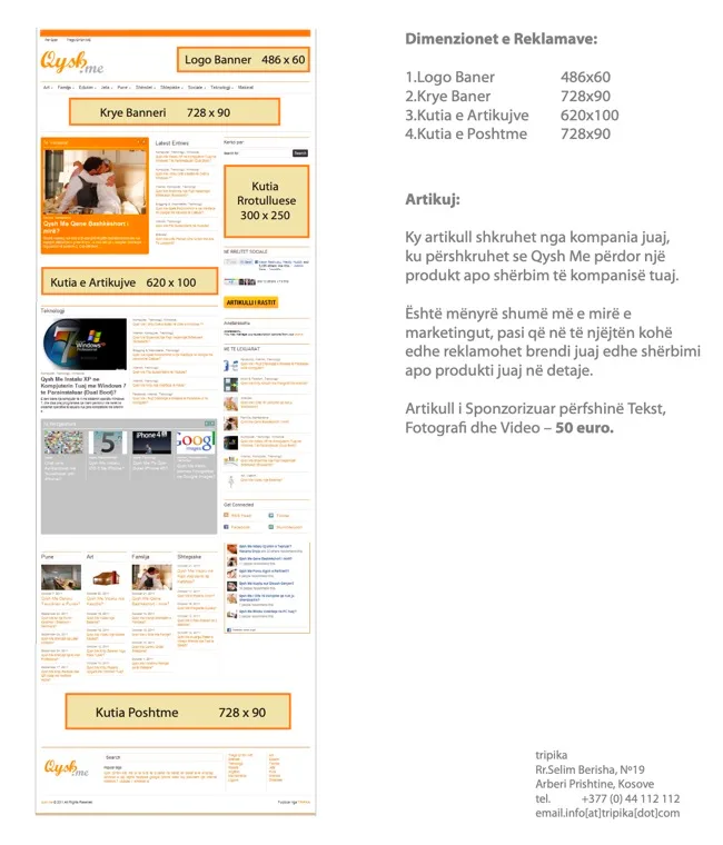
The same plain approach ran across the whole site. A handful of standard banner slots and a sponsored article that let a company be the subject of a genuine how-to.
Nothing about it was sophisticated. But it taught me the real lesson of media economics early. You do not sell traffic. You sell an audience someone wants to reach.
The general site had big raw numbers. The cooking section had something more valuable. A clear, coherent group of people. That is what an advertiser actually pays for.
What I recommend
Watch for the part of your product that grows differently from the rest. Be willing to let it become its own thing.
Give it a name. A look. Room to develop an identity.
Qysh Me Gatu started as a folder of recipes and turned into the clearest audience and the first revenue we ever had. Precisely because we stopped treating it like just another category and started treating it like a table worth setting.
Write a comment