Ripost’s homepage had two halves and they disagreed with each other on purpose.
The top was a mosaic. Big picture, a few featured blocks, the things we wanted you to see. Classic editorial curation. It worked the way a front page works: you scan it in three seconds and either something catches or nothing does.
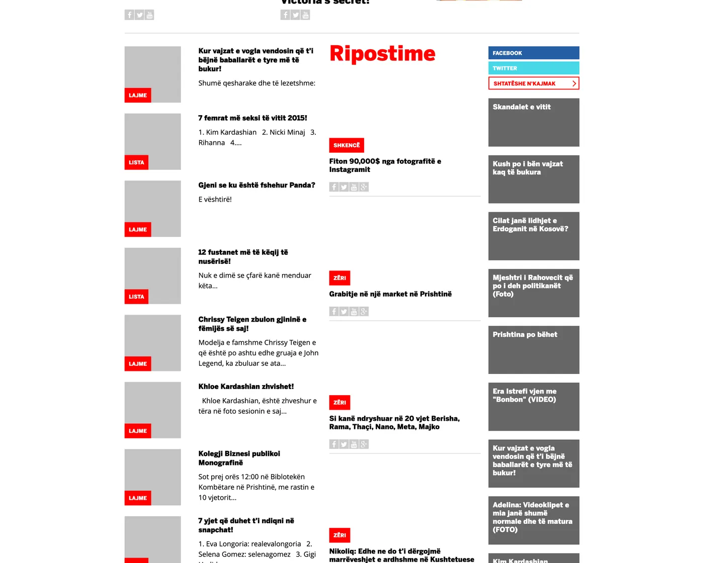
Below that was Ripostime. A column that just kept going.
Two different readers, one page
The mosaic serves the reader who wants to be told what matters. The river serves the reader who is not looking for anything and will keep scrolling until something stops them.
Most media homepages only serve the first one, then wonder why the average visit is one page long. If your entire front page is a curated grid, a reader who is unmoved by the grid has nowhere to go except back to Facebook. The river gave them somewhere: down.
That was the whole product argument. Do not make browsing a dead end.
Labelled by format, not by desk
Each item in the river carried a small red stamp. LAJME for news. LISTA for a list. SHKENCË for science. ZËRI where the item came from a partner in the network.
The label is doing work that a headline cannot. It sets expectations about time and shape before you read a word. LISTA means this is a scroll, it will be quick, there are numbers. LAJME means this is a fact, it will be short, you will be finished in twenty seconds.
Once you are scanning a hundred items in a column, that pre-commitment matters more than the headline. People are not reading the river. They are filtering it, at speed. The format stamp is the fastest signal you can give them.
It also enforced discipline upstream. If a piece has to declare its format in a red box, somebody has to decide what it actually is. A lot of weak media output is weak because that decision was never made: a thing that is half a list, half a report and fully padded.
The parts around it
The river did not run alone. A second column carried longer pulls. A sidebar ran headlines from the wider network alongside it. Three streams moving at different speeds down one page.
That sounds busy. On a desktop monitor it was. But it reflected something true about how people were actually reading: not one thing at a time, in order, but several at once, half-attentively, dipping in.
What I would do differently
Two things.
The river had no memory. Scroll a long way, tap something, come back and you start at the top again. Every infinite feed people love solves this and we did not, which quietly punished the exact behaviour the design was asking for.
And it was built for a big screen first, at a moment when the audience was moving to phones fast. Three parallel columns collapse into one on a phone. The reader loses the thing that made the layout work: seeing several streams at once. The right answer was probably a single, well-labelled river on mobile from the start, with the desktop version treated as the special case rather than the default.
The idea was right. A homepage should be somewhere you can stay. The implementation belonged to the last era of screens rather than the one arriving.
Write a comment