There was a small red BETA sitting under the Ripost logo. It stayed there.
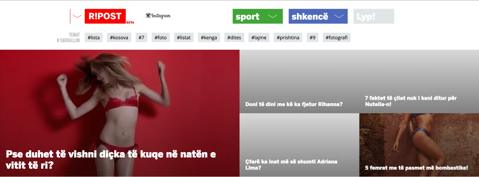
Not because we were hiding behind it. Because it was accurate and because it was the most useful piece of product management on the whole page.
What the label actually did
A finished product has to defend itself. Every change becomes a regression risk, every odd format needs a justification and someone eventually asks whether this is on brand. A beta owes nobody an explanation. You try the thing and if it does not work you take it down without a meeting about what it means.
That is why we kept the label after it stopped being technically necessary. In the beta we were running shows like PunPun, news written short, lists, video news and whatever else we thought the internet could carry that week. Four or five products sharing one masthead. Under a finished brand that reads as incoherence. Under a beta it reads as what it was, which was work in progress conducted in public.
Formats as experiments, not as sections
The unit of development was not the feature. It was the format.
A format got built cheaply, published for a while and judged on whether people did anything with it. The ones that traveled got more attention. The ones that did not got quietly dropped. Nobody had to write a post-mortem about it. This is obvious in software and strangely radical in media, where a section that stops working usually just continues, staffed and unloved, because removing it would embarrass someone.
The discipline was in keeping the cost of trying low. If launching a format takes six weeks of design and a template rewrite, you will not run experiments, you will run bets and you will defend bets long past the point where the numbers stopped agreeing with you.
Sections got their own identity, not their own tab
The other structural decision was to give the big sections real presence instead of hiding them in a dropdown. Sport was green. Shkencë, the science section, was blue. Lyp!, the search, sat next to them in grey.
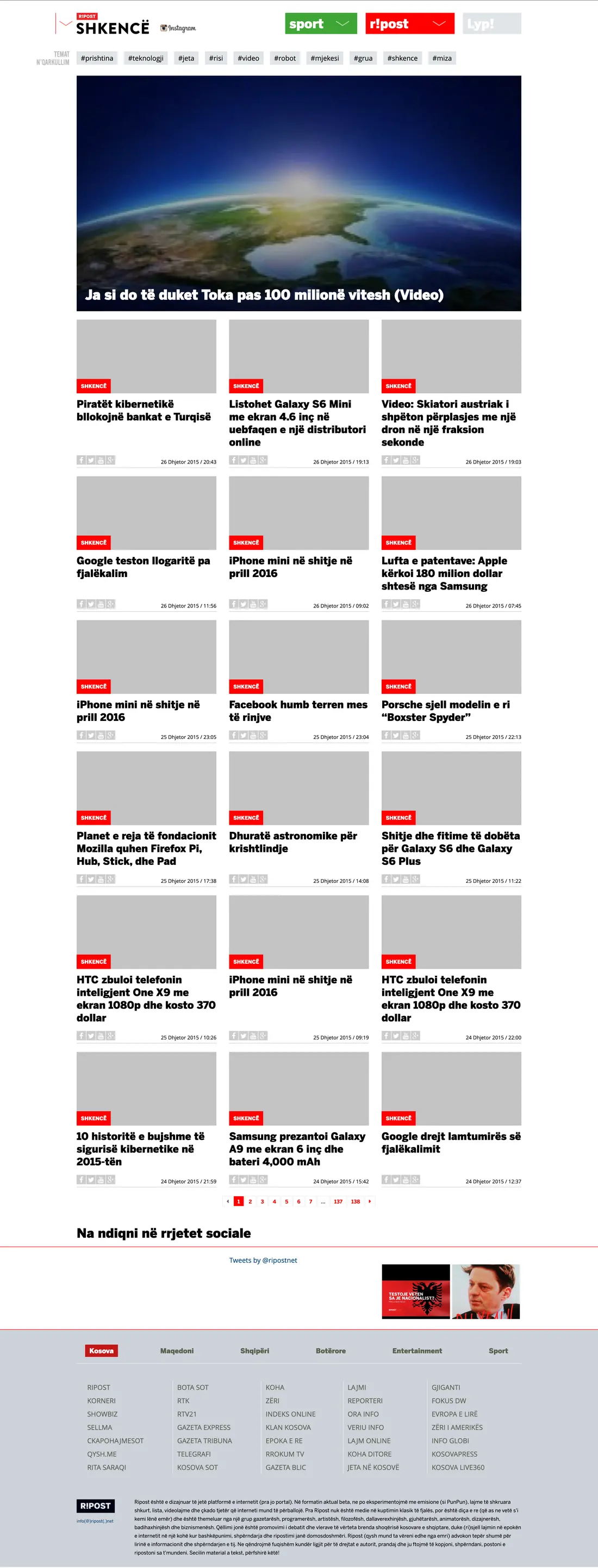
Each one behaved like its own small site: its own topic bar, its own colour, its own rhythm of publishing. Same platform underneath, different personality on top.
The reason was audience, not aesthetics. A person who arrives for science coverage is not the same person who arrives for sport. Asking both of them to start from a shared homepage that serves neither is how portals bore people. Building a section that looks and feels like a destination is cheap. Convincing someone to bookmark a category page is not.
What I would keep
Three things carried over into everything I have built since.
- Keep the cost of an experiment low enough that killing it is painless. Everything else in a product process follows from this. Expensive experiments become commitments.
- A permanent beta is a licence, not an excuse. It only works if you are actually shipping and actually removing things. Otherwise it is a badge on a stale product.
- Give a distinct audience a distinct place. Not a menu item. A place, with its own front door.
Write a comment