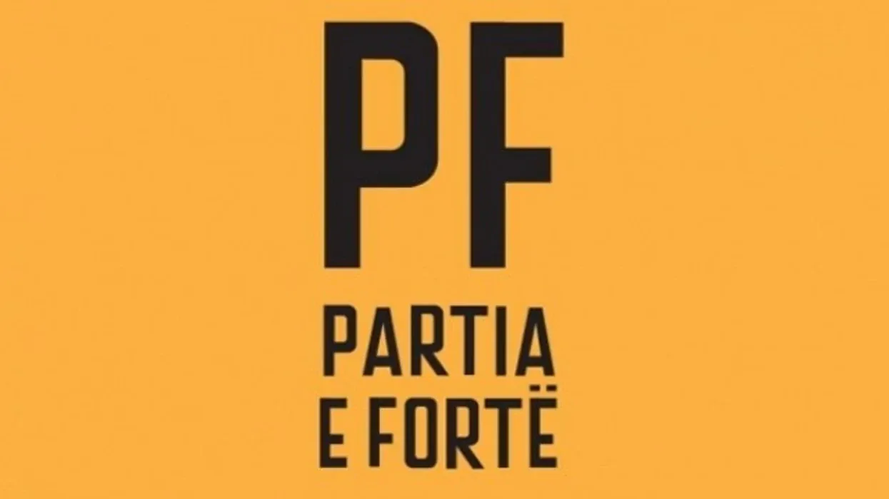
One of the smartest decisions made in Partia e Fortë was made before I could contribute much to it: the party looked completely serious. The visual identity, built by the Pristina design agency Trembelat, was not goofy. It was confident, bold and deliberately more polished than what most real parties were putting out. The custom typeface they used, Kapital, gave everything a kind of institutional weight.
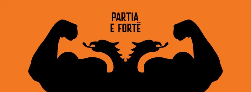
I want to credit that clearly, because design is where a lot of satire dies and ours did not. The people who built the visual system deserve the recognition. My role was on the other side of it, taking that identity into the feed and making sure the digital output honored it. But I learned an enormous amount just from watching how the look did its job.
Here is the thing about the design that took me a while to fully appreciate. The gap between how serious we looked and how absurd our promises were is where the humor detonated. If we had looked like a joke, the promises would have been merely silly. Because we looked like a real, competent, well-organized party, the promises became a devastating parody of every real, competent, well-organized party. The design set up the punchline. The writing delivered it.
For someone running social channels, a strong visual system is a gift you do not fully understand until you do not have it. Every post already belonged to something. I did not have to reinvent the look each time or wonder if a graphic felt on-brand, because the identity was so defined that staying inside it was easy and stepping outside it was obviously wrong. Consistency at the visual level did for the eye what the voice did for the ear. People recognized us in a crowded feed before they read a word.
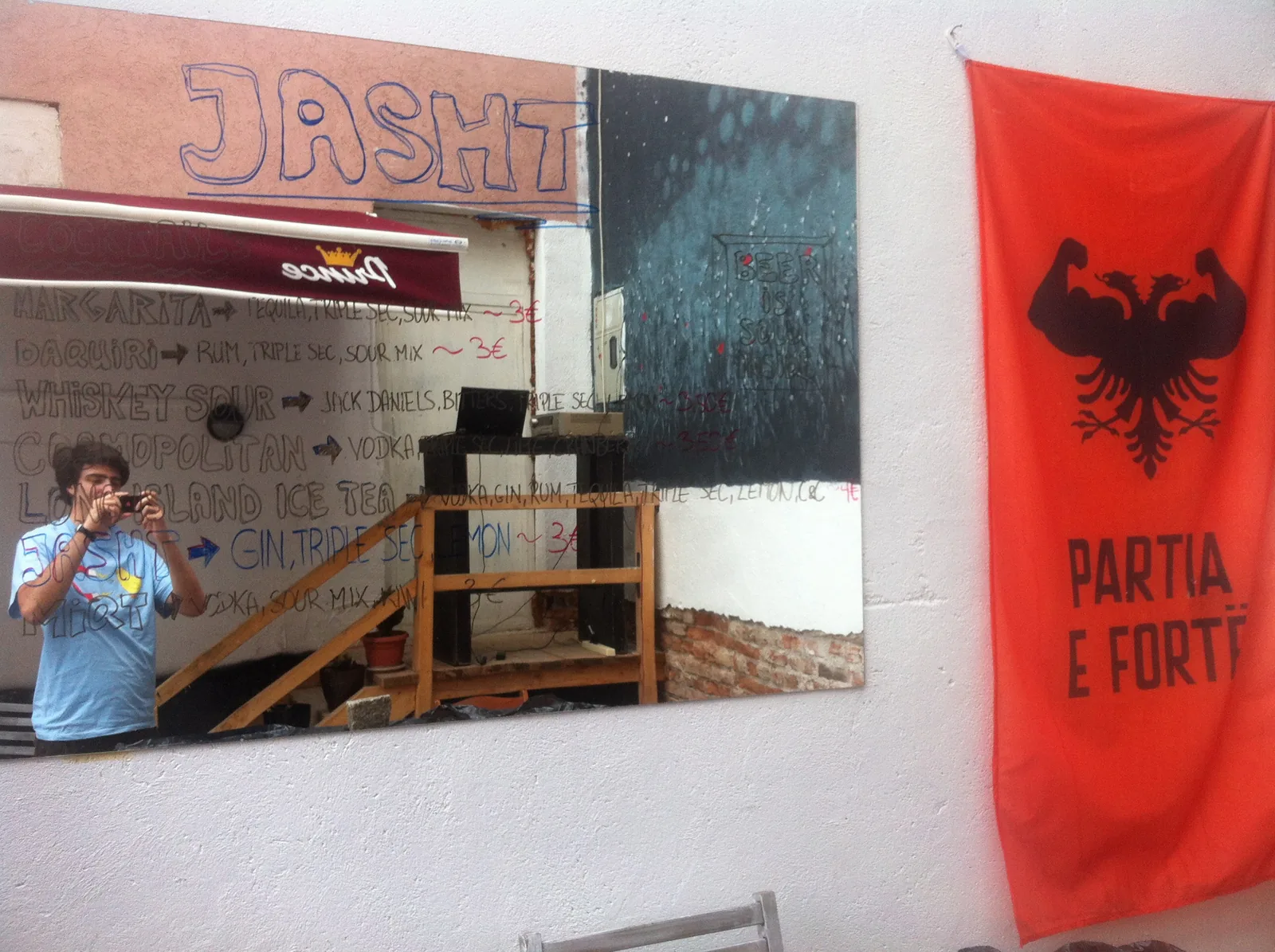
The mark showed up everywhere, on flags, walls and bars around Pristina. It always carried the same confident weight. A muscular double-headed eagle flexing: absurd when you think about it for a second, completely authoritative at a glance. That is the trick the whole identity pulled off.
A few things I took from working next to that identity:
- Look more serious than your competitors, especially if you are the joke. The contrast does the comedic work. It also makes you impossible to dismiss.
- A tight visual system makes a small team fast. When the rules are clear, you stop debating and start shipping.
- The logo is a promise of quality. Ours showed up on things that were funny, sharp and made with care, so the mark itself started to signal “this will be worth your time.”
I am becoming a believer, watching this happen in front of me, that the identity has to be locked down before you scale the content. Not from any textbook, I have not read one. From watching a satirical party out-argue the establishment partly because it has better typography than they do.
Write a comment